High-performing digital businesses rarely rely on dramatic redesigns.Instead, they study user behavior, identify hesitation points, and make incremental interface refinements that convert passive visitors into engaged customers.
These refinements are simple changes that improve clarity, reduce friction, and guide users toward completing an action such as requesting a quote, signing up for a newsletter, or making a purchase.
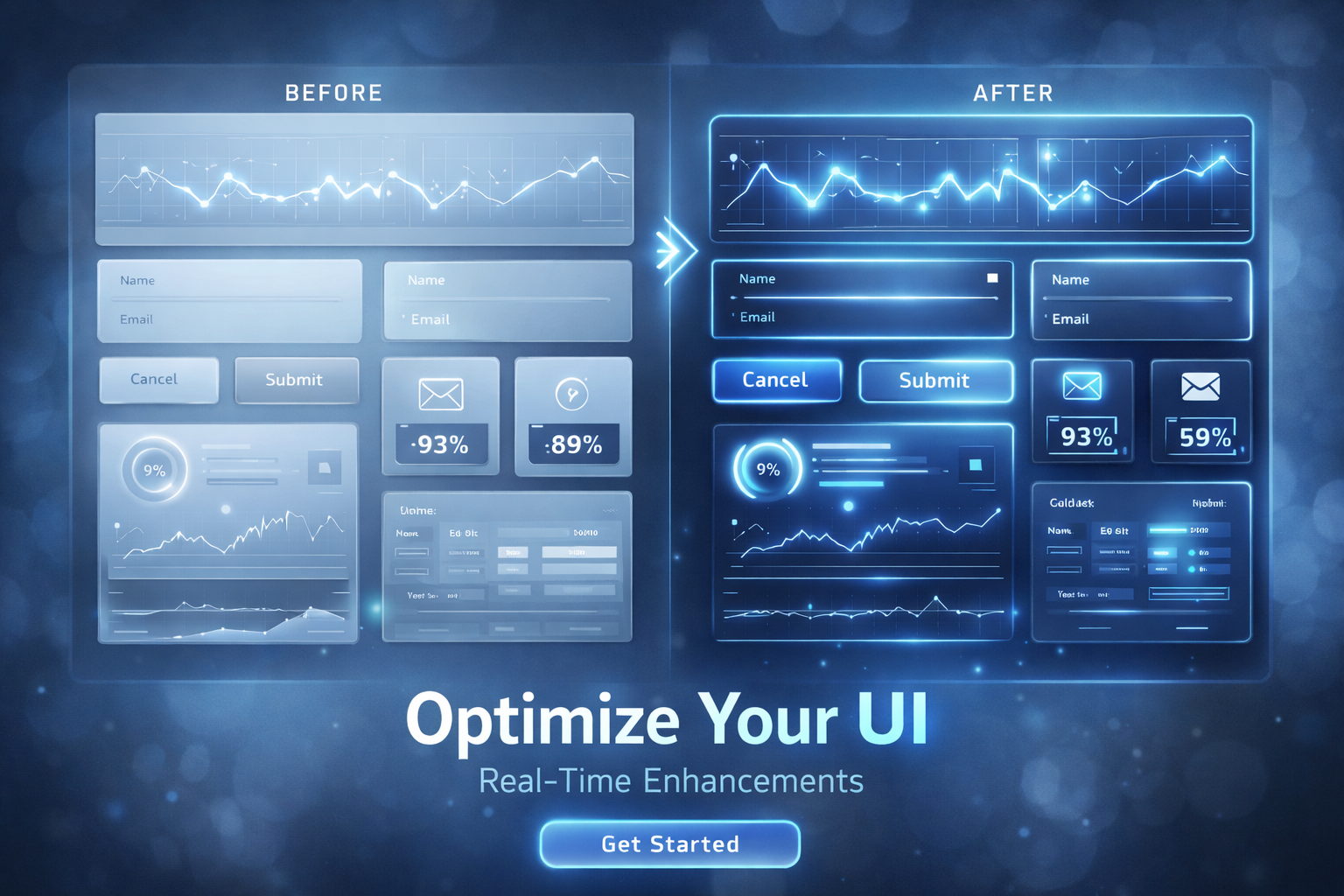
This article explains the fundamental UI adjustments that consistently increase conversions across websites, landing pages, product interfaces, and SaaS platforms. The focus is on practical, research-backed ideas designed for measurable impact in real dashboards, not theoretical design language.
What Makes Small UI Tweaks So Powerful
User interface design is often misunderstood as decoration rather than function.In reality, interface decisions determine how quickly users reach clarity and action. Most users do not stop to reflect on whether a design is impressive. They act only if they immediately understand what to do next.
Small UI improvements work because they remove moments of friction.Friction occurs when a user must think too much, spend extra time, or become uncertain about what action to take. When friction disappears, conversions increase naturally.
The Hero Section: A High-Stakes First Impression
Research shows that visitors make a stay-or-leave decision in three to five seconds. What appears in the hero section directly impacts this decision.
Make the First Impression Count
- Use a headline that delivers a clear benefitBad: Welcome to Our WebsiteBetter: Grow Your Business With Data-Driven Insights
- Communicate value in a single sentence
- Avoid multiple competing CTAs
- Eliminate auto-sliders, which distract and reduce comprehension
- Use authentic imagery that reflects the actual experience
Your hero should answer three questions instantly.Who is this for?What problem do you solve?What is the next step?
Improve Call to Action Strategy
Buttons drive conversions.Yet most websites bury them, repeat vague language, or position CTAs only once.
High-performing CTA practices
- Use action-oriented verbs
- Keep a single dominant CTA per section
- Maintain adequate spacing to prevent crowding
- Repeat CTAs along the scroll path instead of expecting users to scroll back up
Button copy changes alone can produce remarkable effects.For example, switching from Submit to Start My Free Audit can boost engagement because it reinforces clarity and lowers perceived risk.
Form Optimizations That Remove User Resistance
Forms stop more conversions than nearly any other UI element.Users abandon forms when they encounter confusion, time pressure, or distrust.
Reduce barriers by:
- Eliminating unnecessary fields
- Using progressive disclosure techniques
- Implementing field-level validation
- Offering autofill and prefill where safely possible
- Displaying privacy reassurance text near fields that request personal data
One fewer required field can increase completions by double digits.Completion friction compounds quickly, especially on mobile, where keyboards consume screen space.
The Power of Microcopy
Microcopy refers to tiny pieces of text that explain, reassure, or guide the user.It prevents hesitation at the exact moment doubt forms.
Where microcopy matters most
- Under form fields
- During checkout
- Login or password flows
- Error and success states
- Empty state pages or dashboards
Bad example: Password incorrectBetter: Enter at least eight characters to continue
Microcopy communicates empathy, which both humanizes your platform and reduces abandonment rates.
Visual Hierarchy and the Science of Attention
Users rarely read from start to end. They skim.Design must respect this reality by guiding the eyes to what matters most.
Visual hierarchy tactics
- Make headlines and supporting text clearly different in size and weight
- Limit color accents to actionable elements
- Use deliberate whitespace as functional separation
- Create scanning anchors through typography, icons, and containers
- Avoid overwhelming users with too many options at once
A strong hierarchy is invisible to users.Instead of thinking about where to look, the flow feels obvious.
Speed, Responsiveness, and Performance as UI Levers
A slow interface looks poorly designed even if visually flawless.Performance is a UI dimension because users perceive speed as quality.
Performance-boosting adjustments
- Compress hero and gallery images
- Replace heavy video headers with static visual alternatives
- Remove unused scripts and third-party widgets
- Enable lazy loading below the fold
- Optimize rendering for mobile-first usage
Research shows that even a one-second delay can reduce conversions by ten percent or more.Speed is not an engineering afterthought but a core UI requirement.
Remove Cognitive Load With Fewer Choices
Too many options slow decision-making.Users prefer clear paths rather than deeply hierarchical navigation or complex menus.
Reduce decisions by:
- Highlighting a single recommended pricing plan
- Removing low-engagement CTAs
- Using filters and sorting instead of long lists
- Combining similar content under fewer menu items
Choice overload breeds hesitation.Simplicity lowers psychological cost and accelerates conversion.
Trust and Social Proof Integration
Users need reassurance. Trust indicators provide validation that others already benefit from your service or product.
Trust UI placements that increase conversions
- Testimonials near the CTA
- Client or partner logos near top-fold content
- Star ratings and reviews near pricing
- Industry certifications, award badges, and security guarantees
Trust should not live on a separate page.It must appear where hesitation naturally peaks.
Remove Interface Clutter Gradually
Interfaces accumulate elements over time.Businesses add banners, labels, popup promotions, sticky bars, floating chat widgets, and more.
Each extra item steals attention from the conversion path.
Clutter removal techniques
- Audit the interface every quarter
- Identify elements that no longer serve a measurable purpose
- Replace competing banners with a single message
- Use a color system with one conversion color and muted supporting tones
Less competing messaging makes the primary action obvious.
Personalization and Behavior-Based UI Patterns
Modern interfaces recognize users instead of treating each visit as a blank slate.
Smart personalization examples
- Remembered login states
- Returning users skip onboarding
- Location-based currency or delivery promises
- On-page personalization triggered by scroll depth or previous actions
Relevant guidance reduces frustration and shortens the conversion journey.
Beyond Basics: Emerging UI Strategies Worth Testing
Conversion-oriented UI continues to evolve.New strategies are emerging that go beyond design polish.
Growth-focused experiments to consider
- Suggesting next best actions based on observed interactions
- Inline product comparisons rather than linking to separate pages
- A/B testing form steps, button positioning, and pricing layouts
- Showing feature-proof popups that confirm value rather than block flow
- Mini checkouts or light signup options before full commitment
Small experiments produce big learning for future improvements.
How to Measure UI Tweaks Effectively
UI work must be tied to outcomes rather than aesthetics.
Evaluate changes using:
- Conversion rate improvement
- Time to first action
- Scroll depth tracking
- Form abandonment data
- Click map insights
- Funnel attrition analysis
- Customer support tickets that reveal confusion
If users ask the same question repeatedly, UI probably needs clarification.
Conclusion: Micro-Optimizations Build Macro Results
Effective UI strategy is not about one dramatic redesign.It is about dozens of carefully considered adjustments that remove confusion, reduce effort, and support user intent.
When businesses improve clarity, reduce cognitive burden, strengthen trust, and guide action, conversion performance rises without adding traffic or increasing advertising spend.
Small UI changes create big outcomes when applied consistently, measured carefully, and informed by user behavior rather than design preference.
To summarize the transformation path:Start with clarity.Remove friction.Support commitment.Build trust during uncertainty.Test and evolve continuously.
That is how modern interfaces convert more users and fuel growth.