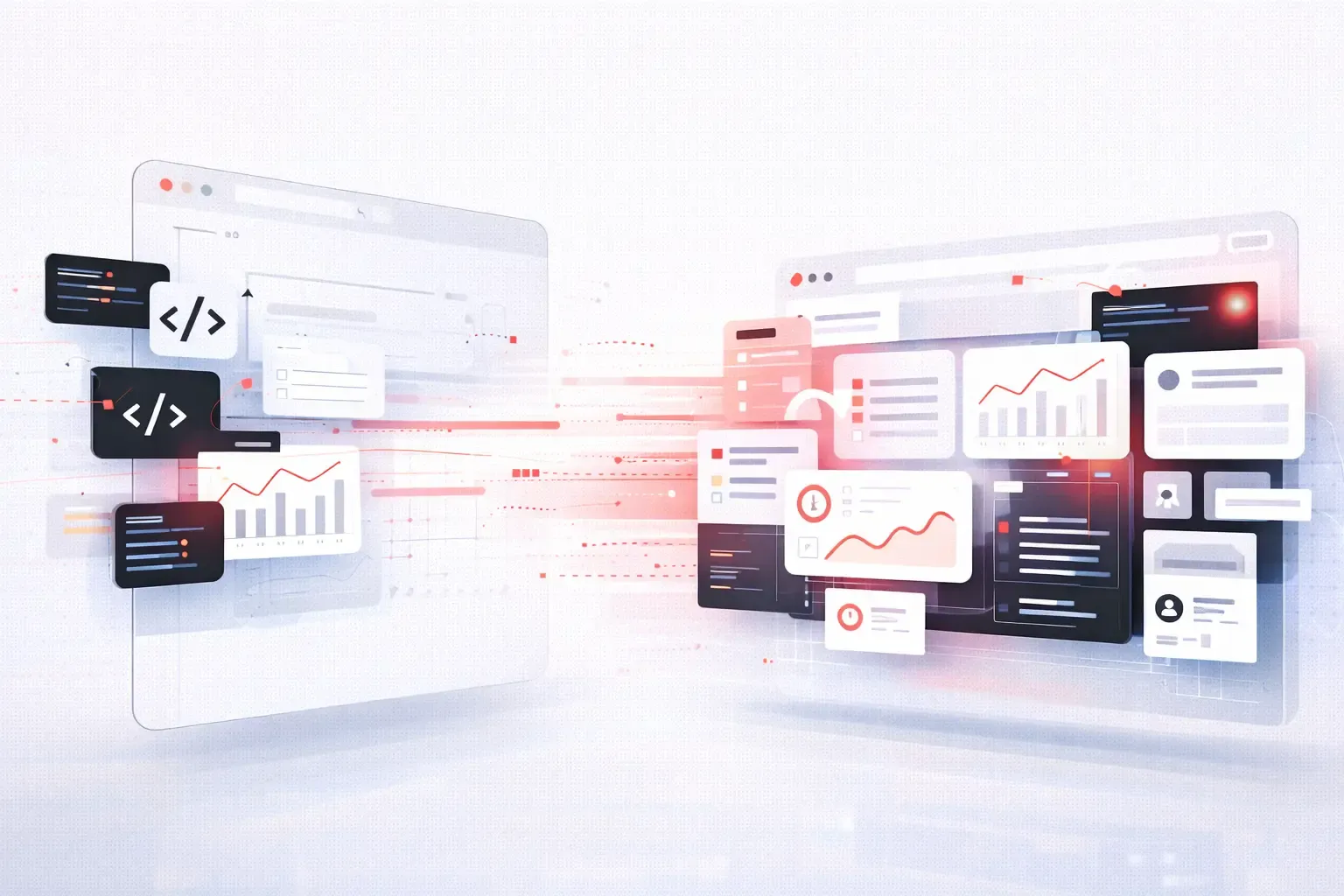
Websites are no longer static pages that look the same for every visitor. A new generation of digital experiences is emerging where layouts adapt in real time based on user behavior, device, intent, and context. These are often called shapeshifting websites.
Instead of asking users to adapt to interfaces, these websites adapt to users.
What Are Shapeshifting Websites?
A shapeshifting website is a dynamic system that reorganizes its layout automatically based on live signals. These signals can include user behavior, screen size, interaction patterns, location, time of day, or even predicted intent.
Unlike traditional responsive design, which adjusts layout mainly for screen size, shapeshifting design goes much deeper.
It changes:
- Content hierarchy
- Navigation structure
- Visual emphasis
- Interaction patterns
All in real time.
Responsive Design vs Shapeshifting Design
Responsive design was a major breakthrough, but it still follows predefined rules.
Responsive websites
- Adjust for mobile, tablet, and desktop
- Use fixed breakpoints
- Serve the same content order
Shapeshifting websites
- React to how users behave
- Reorder content dynamically
- Adapt layouts per user session
- Optimize for intent, not just screen size
In short, responsive design adapts to devices. Shapeshifting design adapts to people.
What Powers Shapeshifting Websites?
Shapeshifting websites are possible because of several modern technologies working together.
AI and Machine Learning
AI models analyze user behavior in real time and predict what content should appear next, what layout works best, and which elements deserve attention.
Real-Time Analytics
Instead of waiting for reports, these systems act instantly. Scroll depth, hover behavior, clicks, and pauses all influence layout decisions.
Component-Based UI Systems
Modern frontend frameworks allow layouts to be assembled like building blocks. Components can appear, disappear, resize, or move without reloading pages.
Edge Computing
Decisions happen closer to the user, reducing latency and making dynamic layout changes feel instant.
How Shapeshifting Layouts Actually Work
Behind the scenes, a shapeshifting website operates like a decision engine.
A simplified flow looks like this:
- User lands on the page
- System analyzes device, referral source, and behavior
- Layout components are ranked by relevance
- Page rebuilds itself dynamically
- Layout keeps adapting as the user interacts
The website is never truly finished rendering. It is constantly evolving.
Real-World Use Cases of Shapeshifting Websites
This concept is already being used quietly across industries.
Ecommerce
Product grids change based on browsing behavior. High-intent users see fewer distractions and faster checkout paths. Explorers see richer discovery layouts.
SaaS Platforms
New users see guided layouts with education-first components. Power users see dense dashboards and shortcuts.
Content and Media Sites
Long-form readers see distraction-free layouts. Skimmers see summaries, cards, and quick navigation.
Marketing Landing Pages
Headlines, CTAs, and page structure shift depending on traffic source, campaign intent, or user profile.
Benefits of Shapeshifting Web Design
Shapeshifting layouts offer clear advantages over static experiences.
Key benefits include:
- Higher engagement rates
- Faster task completion
- Lower bounce rates
- Better personalization without friction
- Improved accessibility
Users feel like the website understands them without asking questions.
UX Challenges and Ethical Considerations
With great adaptability comes responsibility.
Cognitive Consistency
Too much change can confuse users. Layouts must evolve smoothly without breaking familiarity.
Transparency
Users should not feel manipulated. Design changes should feel helpful, not deceptive.
Privacy
Shapeshifting should rely on contextual signals, not invasive tracking. Privacy-first design is essential.
Testing Complexity
Traditional A/B testing becomes harder when layouts are constantly changing.
Design systems must balance intelligence with predictability.
Shapeshifting Websites and the Future of UX
Shapeshifting design is a natural evolution toward what many call ambient UX or invisible interfaces.
In the future:
- Websites will feel less like pages and more like conversations
- Layouts will respond before users click
- Interfaces will appear only when needed
- Personalization will feel effortless and non-intrusive
This moves the web closer to human-centered computing.
Should Every Website Be Shapeshifting?
Not necessarily.
Shapeshifting works best when:
- Users have diverse goals
- Content is modular
- Real-time signals matter
- Personalization improves outcomes
For simple informational sites, static or lightly adaptive layouts may still be ideal.
The goal is not complexity, but relevance.
Final Thoughts
Shapeshifting websites represent a shift in mindset. Instead of designing fixed layouts, teams design systems that think.
As AI, real-time analytics, and component-driven architectures mature, dynamic layout rebuilding will become standard rather than experimental.
The future of the web is not responsive.It is adaptive, predictive, and alive.